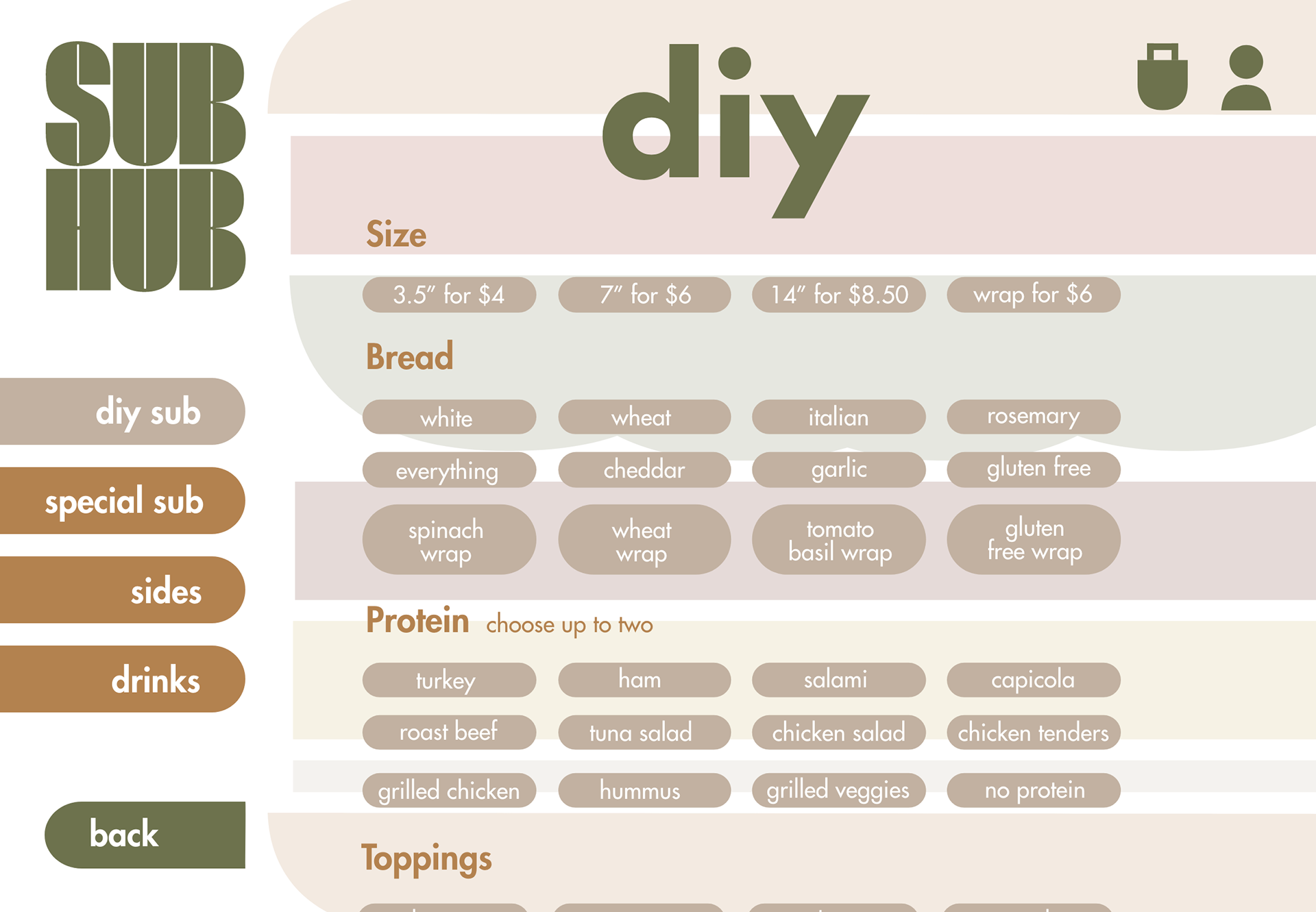
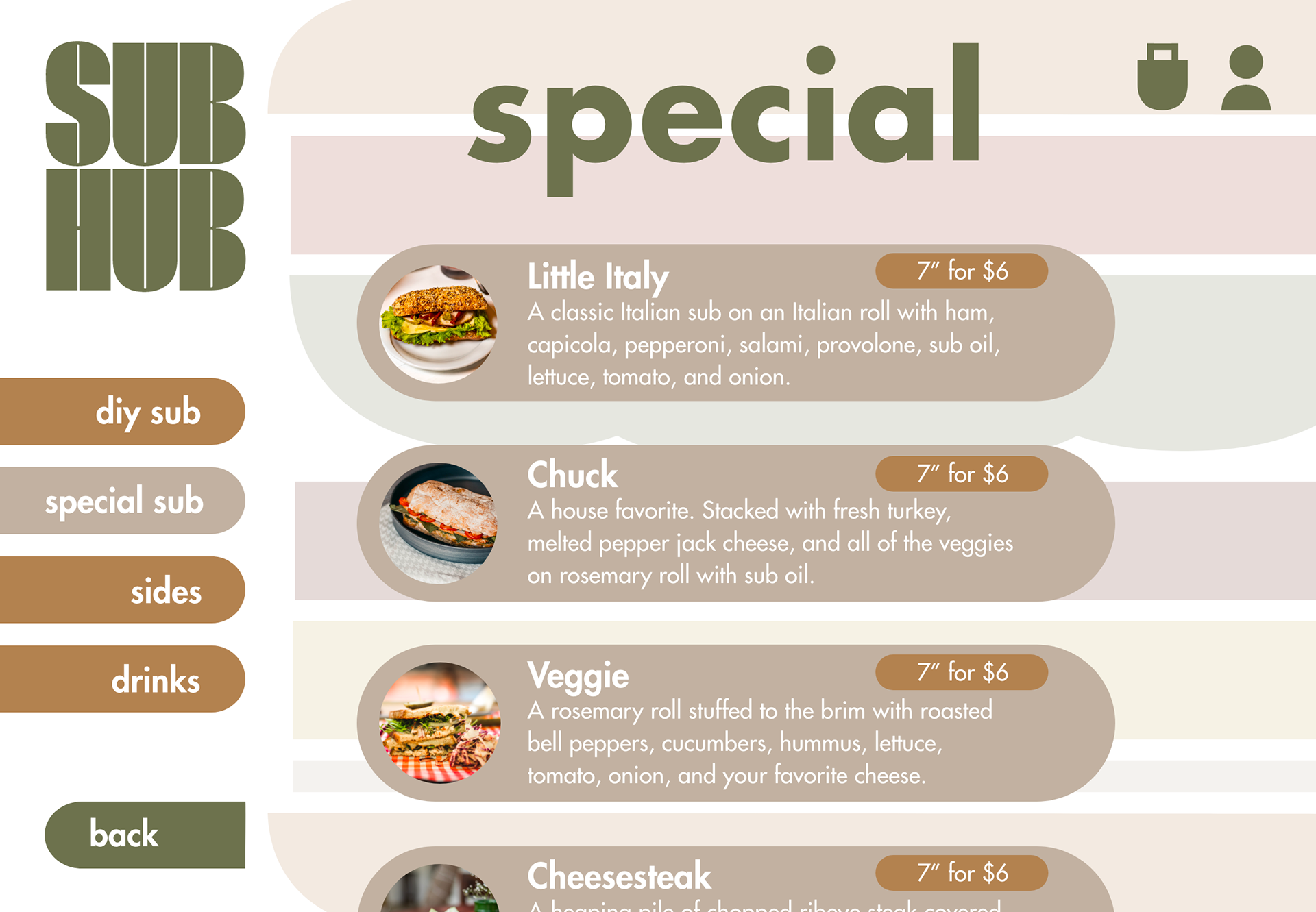
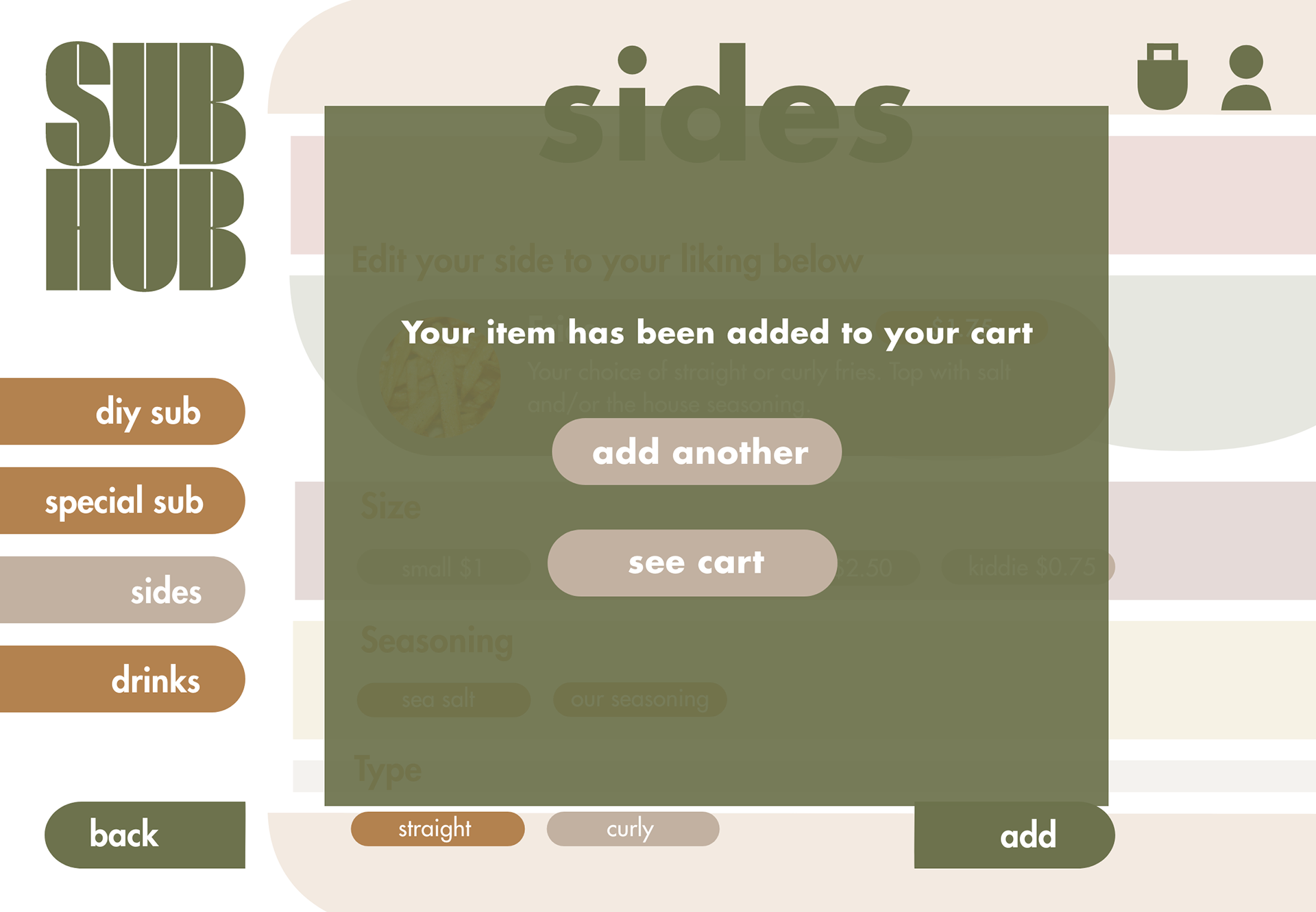
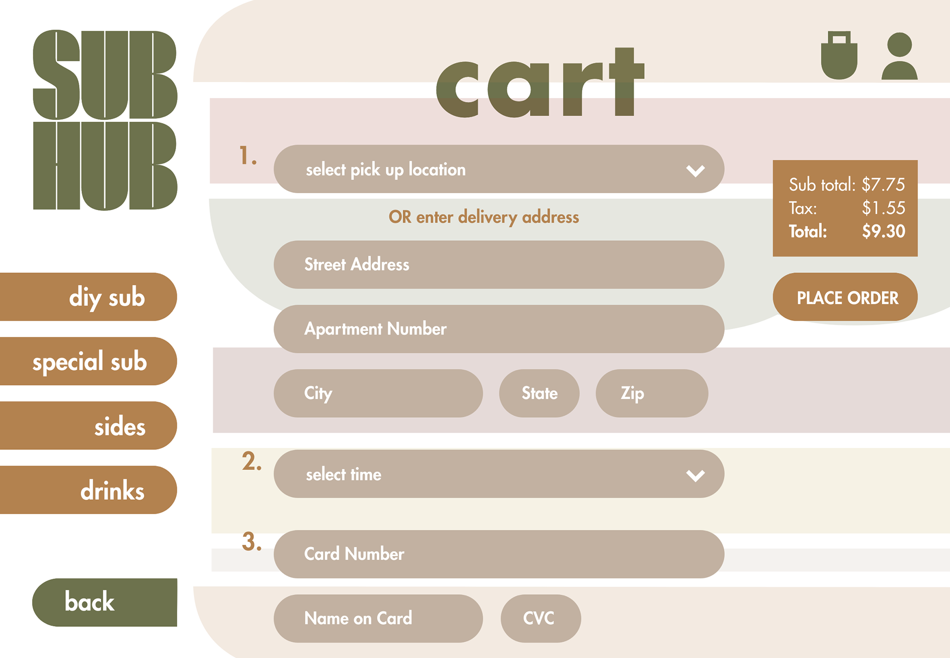
TASK: Design a simple, interactive kiosk for customers to order at Sub Hub.
SOLUTION: An inviting, playful interface that allows users to easily navigate and order food items in a quick and easy manner.
SOLUTION: An inviting, playful interface that allows users to easily navigate and order food items in a quick and easy manner.
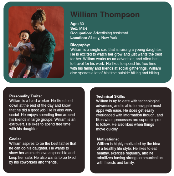
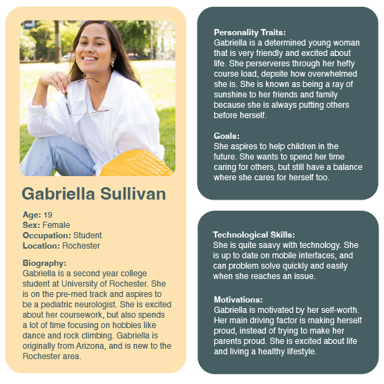
User Personas
The kiosk interface design had to be made intentionally for a target market that would feel comfortable using a device to order a meal, while still remaining accessible to those that have limited technological experience.
The kiosk interface design had to be made intentionally for a target market that would feel comfortable using a device to order a meal, while still remaining accessible to those that have limited technological experience.
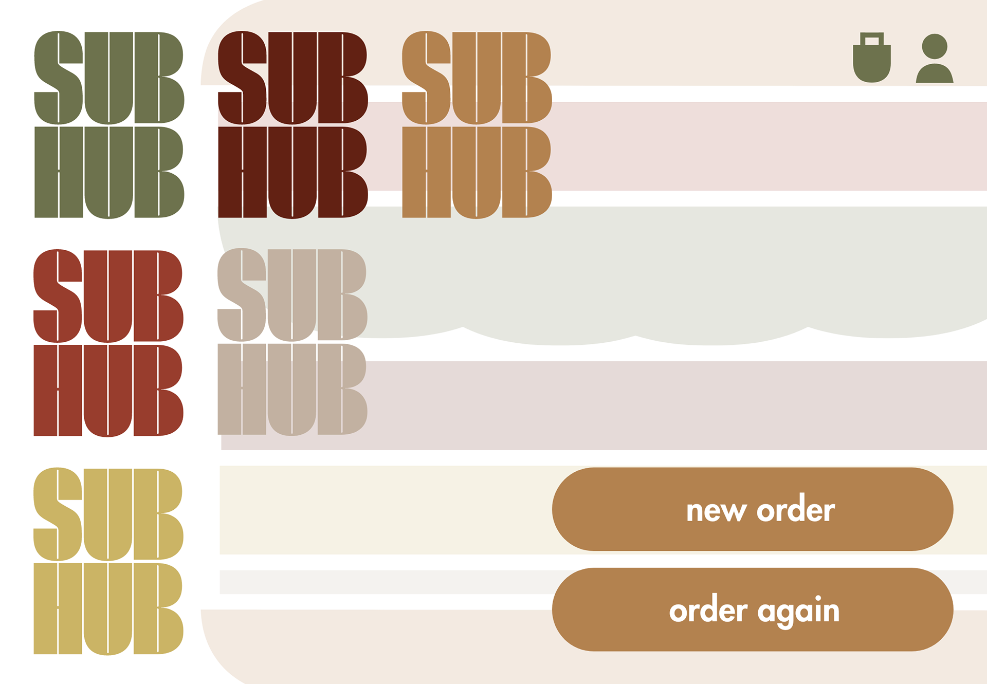
Branding
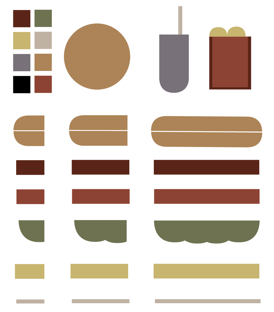
Basic shapes were sampled from the logotype to create sub-shapes and icons for the kiosk. This formed a complete feel to the identity.
Basic shapes were sampled from the logotype to create sub-shapes and icons for the kiosk. This formed a complete feel to the identity.
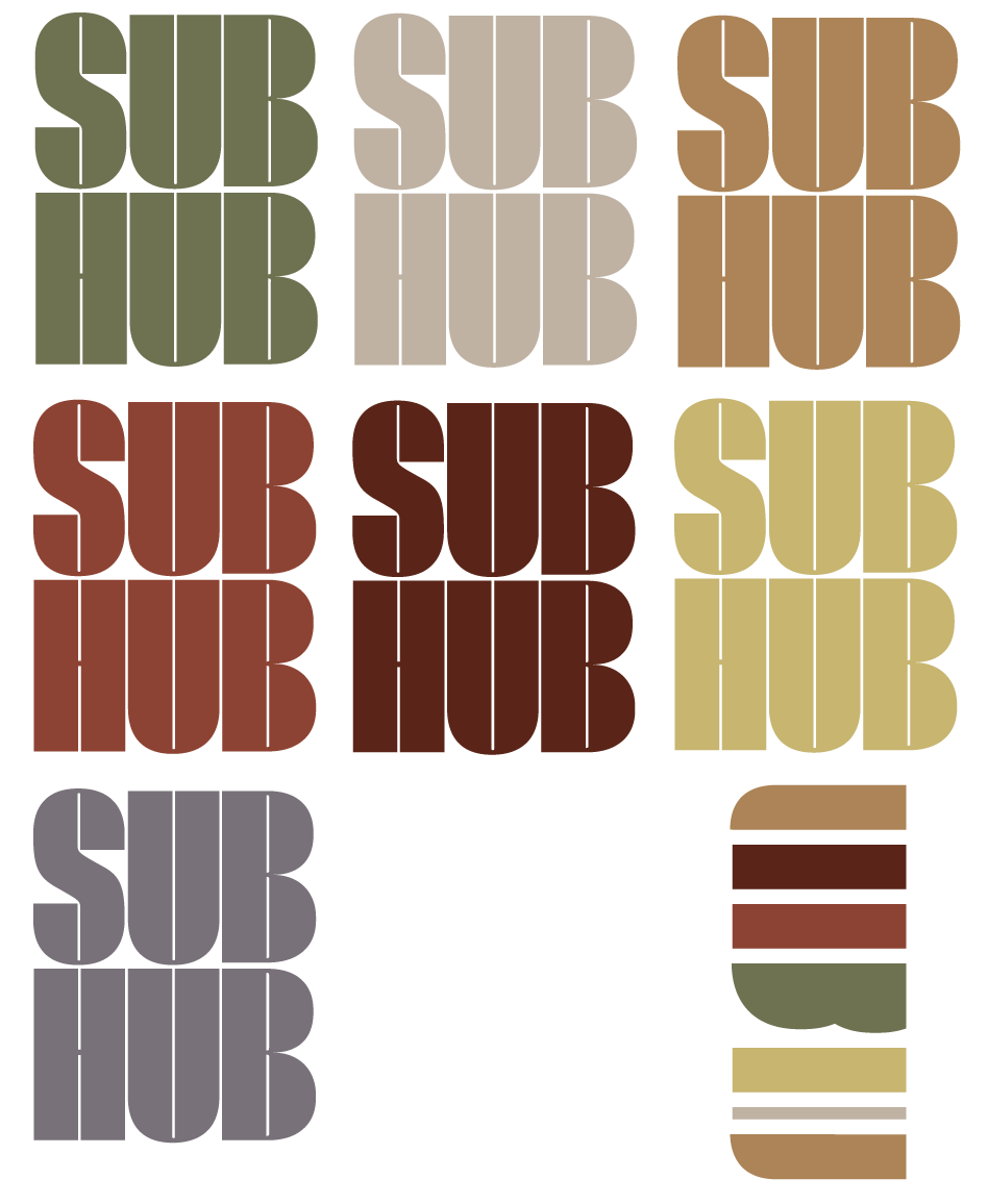


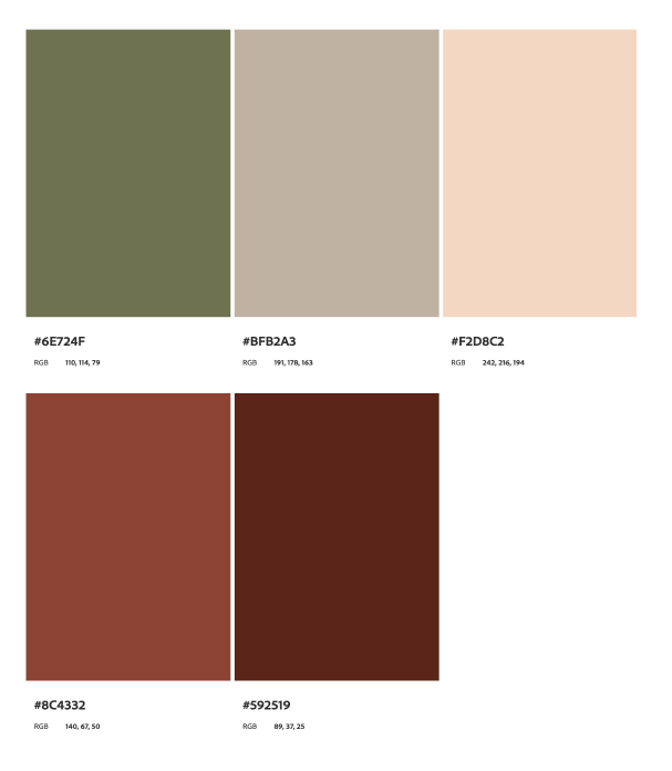
Color and type studies were conducted to find the warm and welcoming feel of the business.
A rounded, high-contrast typeface was chosen for the logotype to focus the identity style on geometric shapes.
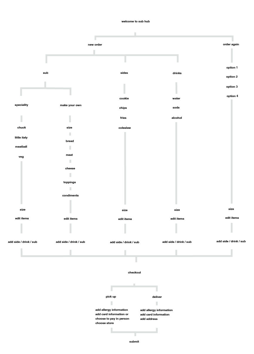
Site Map
To determine the flow of the interface, I created a site map that shows the navigational options that the user will have on each screen.
To determine the flow of the interface, I created a site map that shows the navigational options that the user will have on each screen.