TASK: Rebrand an adaptive sports center to expand its reach and image.
SOLUTION: An active, enthusiastic, and inclusive identity for STRIDE Adaptive Sports.
SOLUTION: An active, enthusiastic, and inclusive identity for STRIDE Adaptive Sports.
Team Effort
Brand Design, Language, and Copywriting by Char Miller
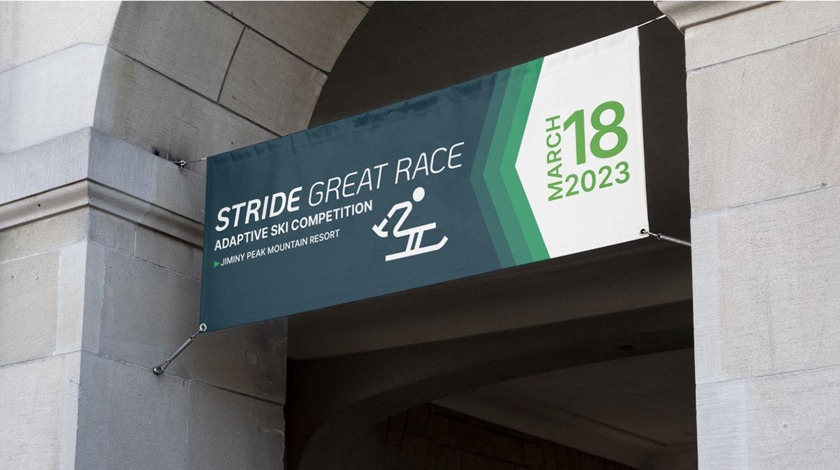
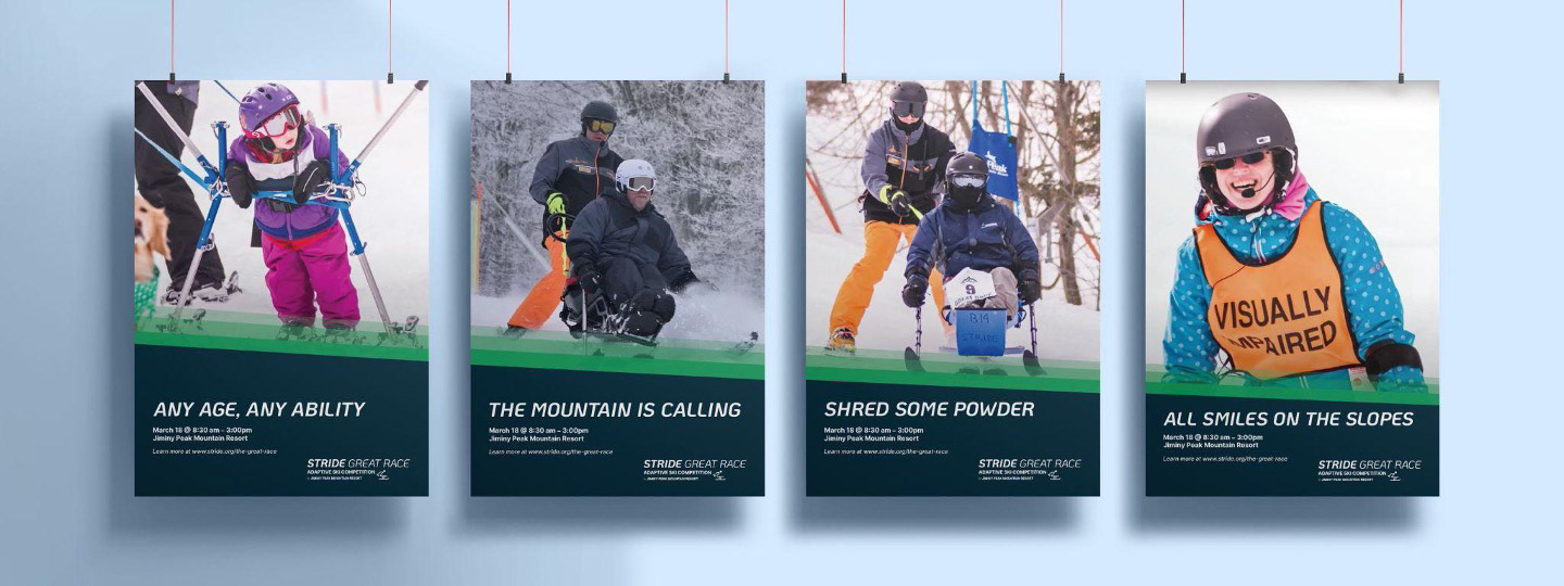
Posters and Banner by Gabi Johnston
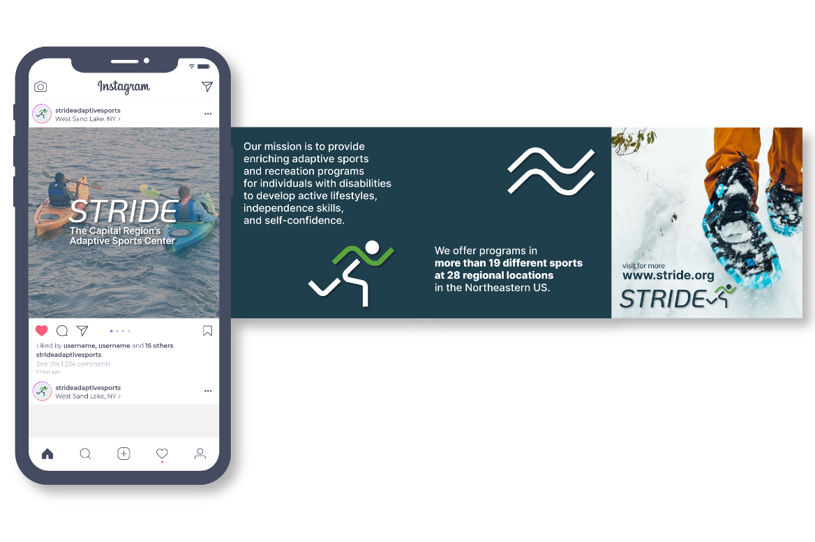
Social Media Campaign by Ceren Gol
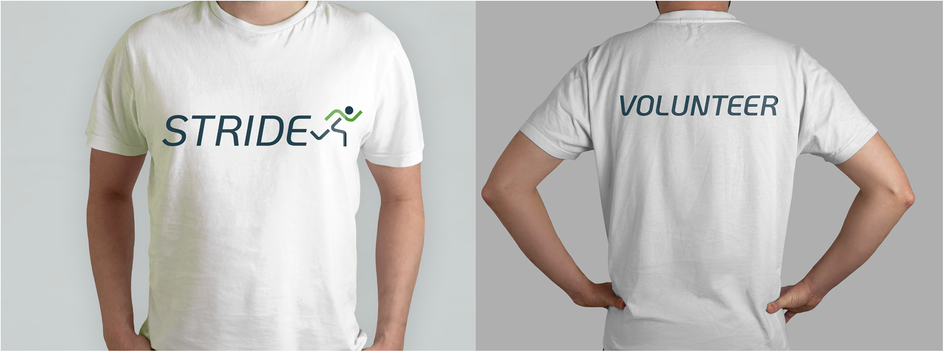
T-Shirts by Christina Rumpf
Web Advertisement by Liza Shayevich
Research by all members
Photography from stride.org
Brand Design, Language, and Copywriting by Char Miller
Posters and Banner by Gabi Johnston
Social Media Campaign by Ceren Gol
T-Shirts by Christina Rumpf
Web Advertisement by Liza Shayevich
Research by all members
Photography from stride.org

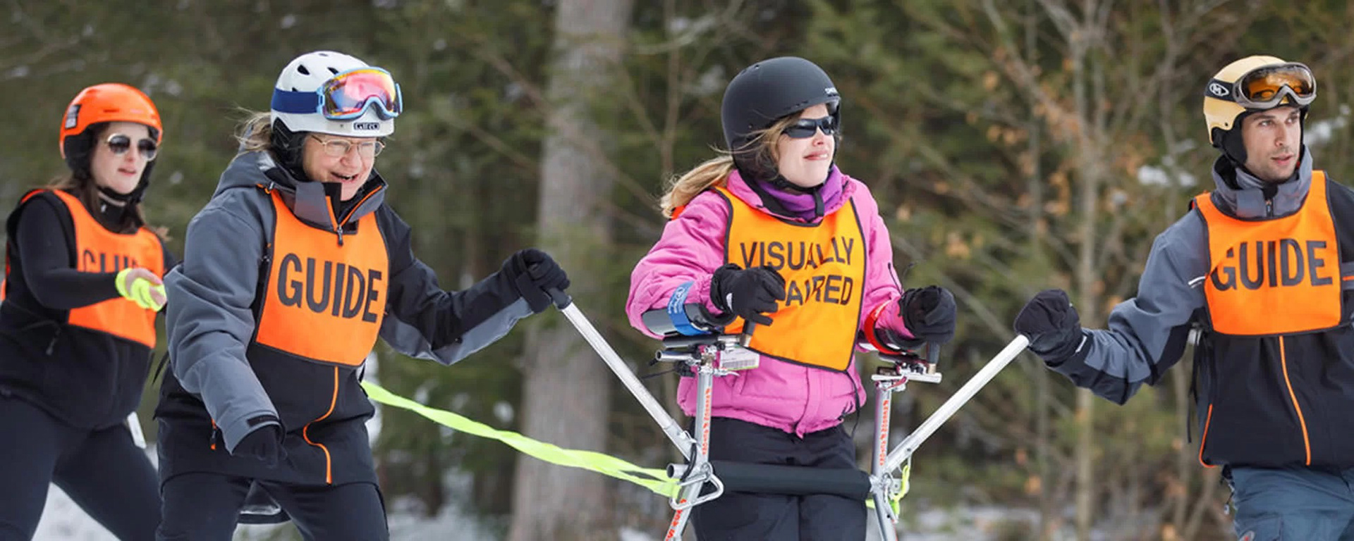
STRIDE is an adaptive sports center in West Sand Lake, NY.
They specialize in developing lifetime sports skills in individuals with disabilities.
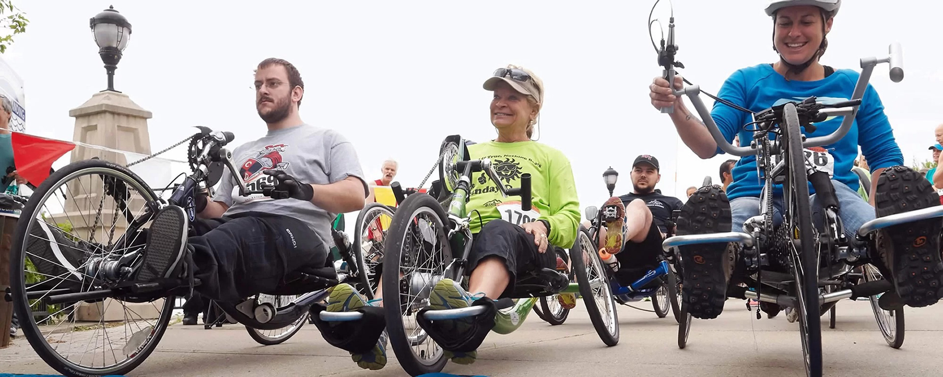
What began as swim lessons and extracurriculars quickly grew to be a community space with over 17 adaptive sports and recreation programs for all ages and abilities.
They specialize in developing lifetime sports skills in individuals with disabilities.
What began as swim lessons and extracurriculars quickly grew to be a community space with over 17 adaptive sports and recreation programs for all ages and abilities.

Design Objectives
Create an enthusiastic, active identity that brings excitement to STRIDE's programs.
The look must be clean, modern, inclusive, and accessible.
Create an enthusiastic, active identity that brings excitement to STRIDE's programs.
The look must be clean, modern, inclusive, and accessible.
The Look
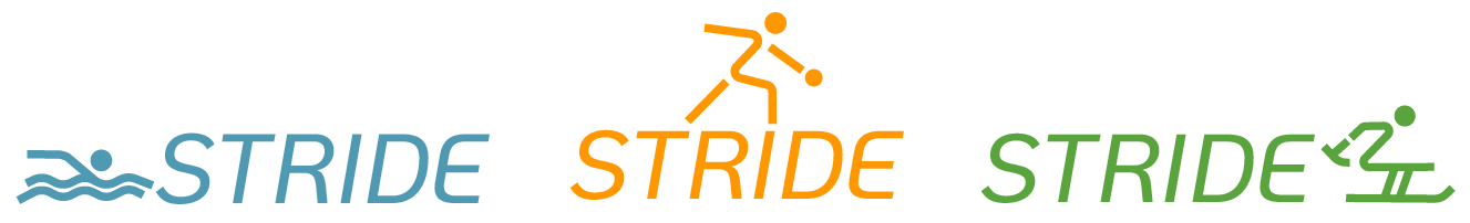
STRIDE's new mark features a striding figure in motion.
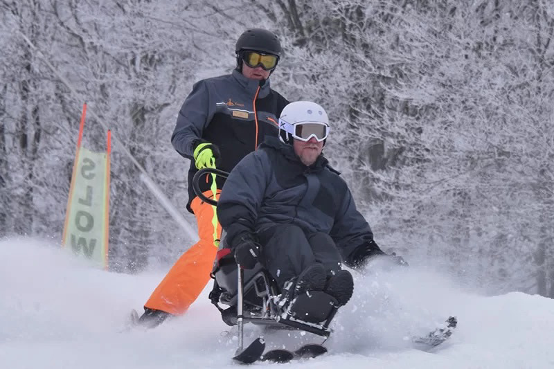
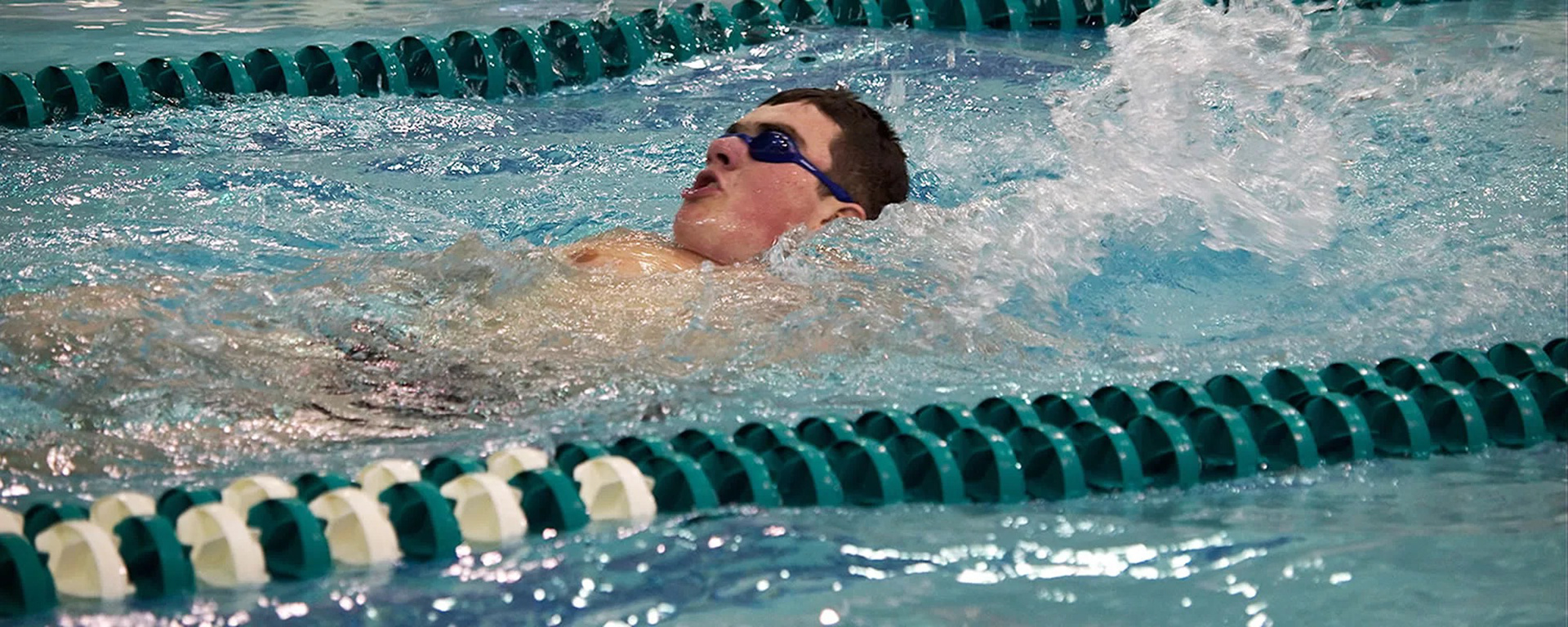
Inspired by the Olympic sports icons, STRIDE's new mark allows for representation of all the programs that they offer. Show below are for their adaptive swimming, bowling, and skiing programs.
STRIDE's new mark features a striding figure in motion.
Inspired by the Olympic sports icons, STRIDE's new mark allows for representation of all the programs that they offer. Show below are for their adaptive swimming, bowling, and skiing programs.


Typography and Color
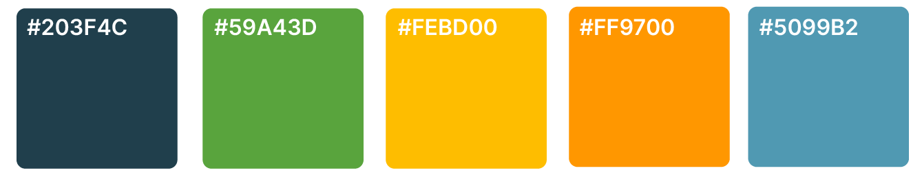
The typeface in the mark is Koho Medium Italic. The line style fits that of the icons, and the italicization is forwarding moving, and energetic.
The colors are active, loud, and free-spirited. The green is STRIDE's current accent green, and the rest of the identity's colors were built outward from it.

STRIDE's New Mission Statement
Our mission is to provide enriching adaptive sports and recreation programs for individuals with disabilities to develop active lifestyles, independence skills, and self-confidence.
Our mission is to provide enriching adaptive sports and recreation programs for individuals with disabilities to develop active lifestyles, independence skills, and self-confidence.
Environmental Design
Posters and Banner by Gabi Johnston
Posters and Banner by Gabi Johnston
Online Marketing Campaign
Social Media Campaign by Ceren Gol
Web Advertisement by Liza Shayevich
Social Media Campaign by Ceren Gol
Web Advertisement by Liza Shayevich

By Christina Rumpf